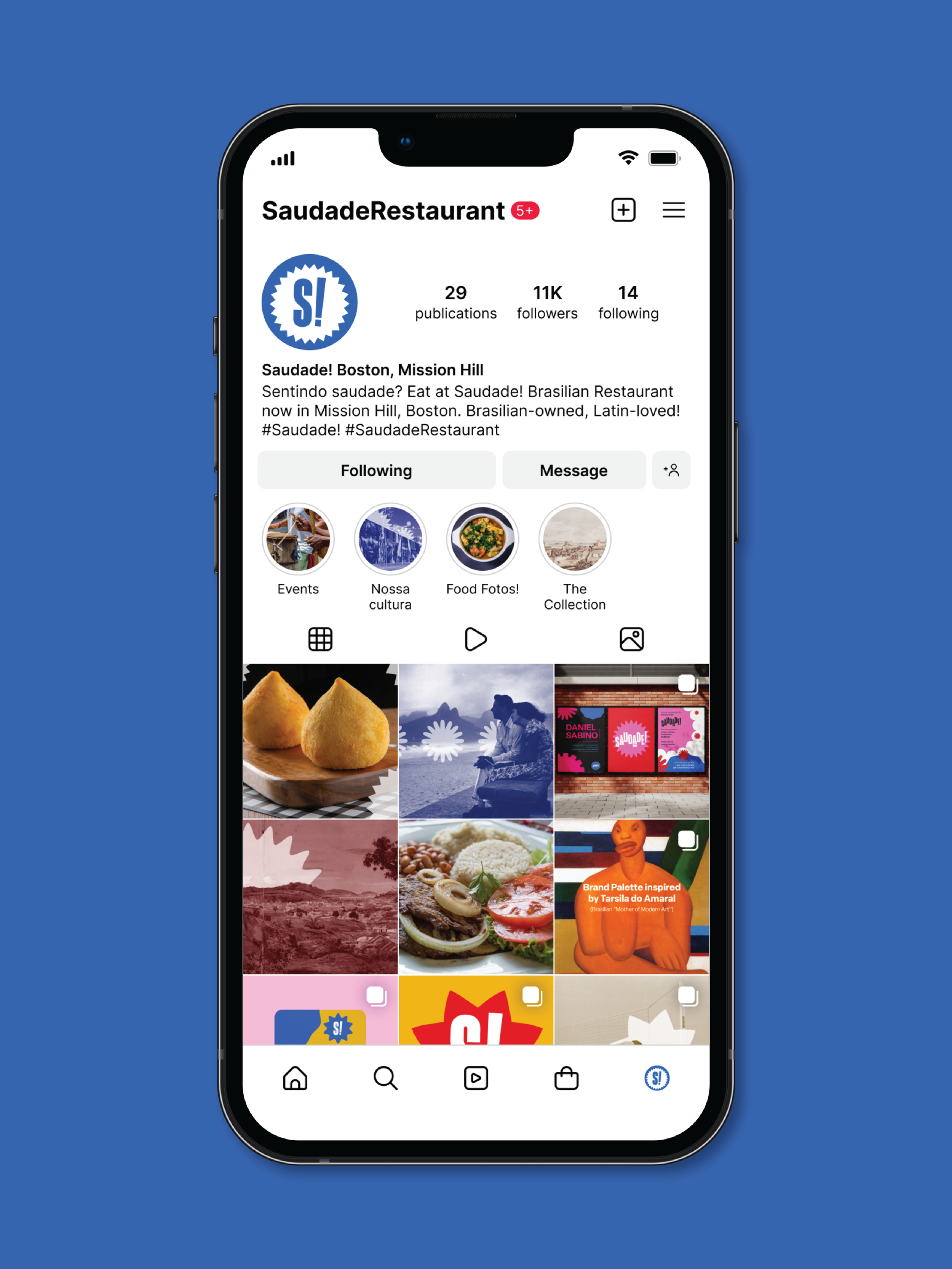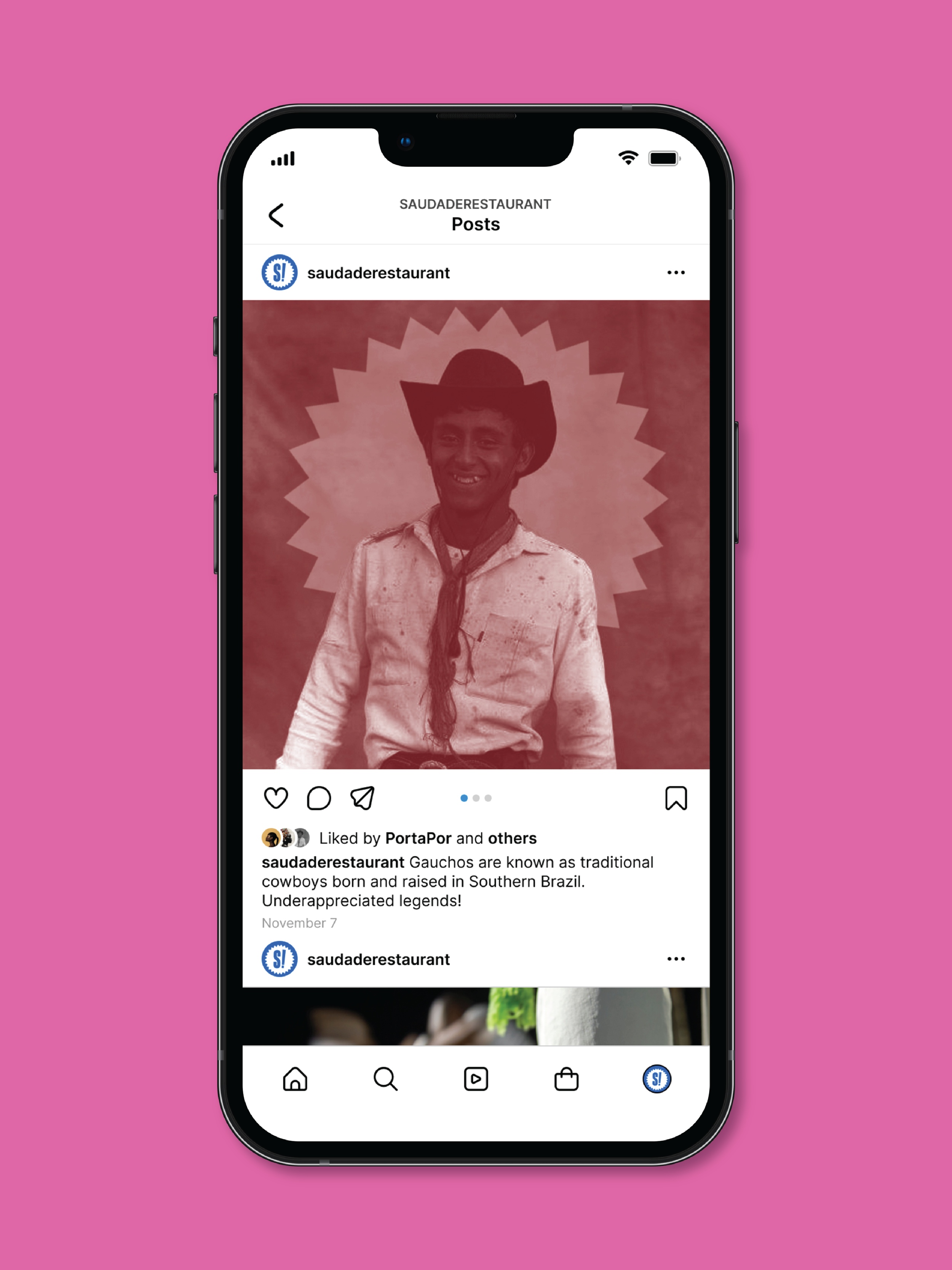
'Saudade!' Restaurant
Branding, Print, Web, and Social Media Design
Saudade is “a feeling of longing, melancholy, or nostalgia of the Brazilian or Portuguese temperaments.”
Inspired by contemporary Brazil's vibrant history, culture, and art/design scenes, the iconography, colors, and typefaces all pay homage to the country. An intimate twist on the Portuguese term, ‘Saudade!’ encapsulates the hopeful longing when you miss a faraway home’s food.
Branding includes two Main Menus, one Kids Menu, three Brand Posters, a Set of Coasters, and Social Media. 2024 academic project.
Bossa Nova legend Joao Gilberto and his first album’s original typeface, “Chega de Saudade,” directly influenced the primary and secondary logo design.
The feeling of ‘saudade’ varies from sadness to disappointment and even joyfulness. Similar to the moods of the Bossa Nova genre itself, I wanted the restaurant's various logos to have a range of capabilities and emotions.
Inspired by a personal and beloved Brazilian guitarist.


